Choosing your wedding colors can be one of the most exciting and hardest parts in the wedding planning process. Because colors influence much of the planning process, it’s important to pick colors that you absolutely love! Check out these tips for picking your wedding colors!
Location Location
It’s amazing how much influence the location of your ceremony and reception has on your color scheme. And rightfully so! Picking colors that match the overall venue is one of my biggest recommendations. If you already have colors in mind, consider bringing swatches to your venue tours and picking a spot that is cohesive with your overall vision. When looking at the space, look up and down! If the space has a brightly colored and intricate carpet, consider drawing from those colors or opting for neutrals. If you’re in a warehouse or barn, your options are almost limitless! Let your colors enhance the venue and vice versa 🙂
Go with the Seasons
Another factor to consider when picking your wedding colors is the season. Especially in places like Chicago or New York where the seasons are beautifully distinct, consider choosing wedding colors that will enhance the season of your special day. Silver shades look beautiful in winter, deep oranges and reds in the fall, coral in the summers, and pastel pinks in the spring. With that being said, pick colors that you love and enhance the venue before going seasonal.
Good Vibes Only
Have you ever heard of color therapy? Chromotherapists believe that color and light have healing properties and can affect the way you feel. Believe what you like, but your color choices will affect the mood of your wedding. Do you want something dramatic? Opt for blacks, deep reds and golds. Something light and fun? Choose bright colors!
Shop Around
Look at magazines, blogs, and books for inspiration! Your wedding will never be exactly like anyone else’s so don’t be afraid to choose colors that inspire you (even if someone else used them before).
Opposites Attract
Remember that big color wheel your middle school art teacher held up? If you don’t, take a peek at one online! Picking colors that are opposite each other on the color wheel is an easy way to incorporate both cool (blues, greens, purples) and warm (reds, yellows, oranges) into your special day. Another option is to choose neighboring colors as they share a parent (primary) color. A good rule of thumb is to pick one saturated color with a neutral.
Don’t Overthink it!
Don’t let picking wedding colors stress you out. Pick colors that you love and don’t be afraid of having everything match perfectly. This is your big day and you should pick colors that you absolutely love!
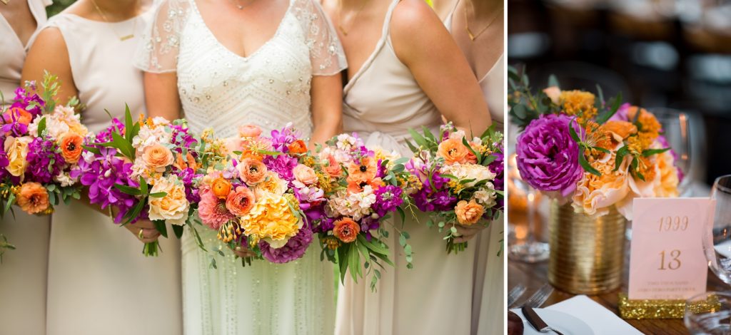
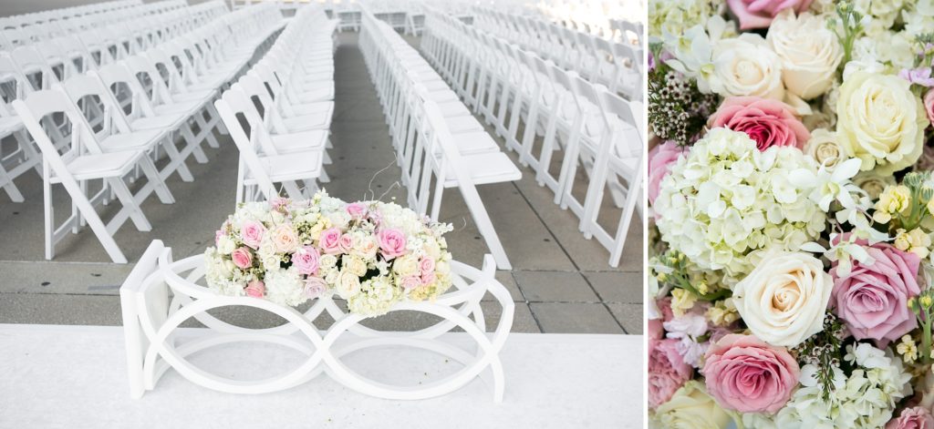
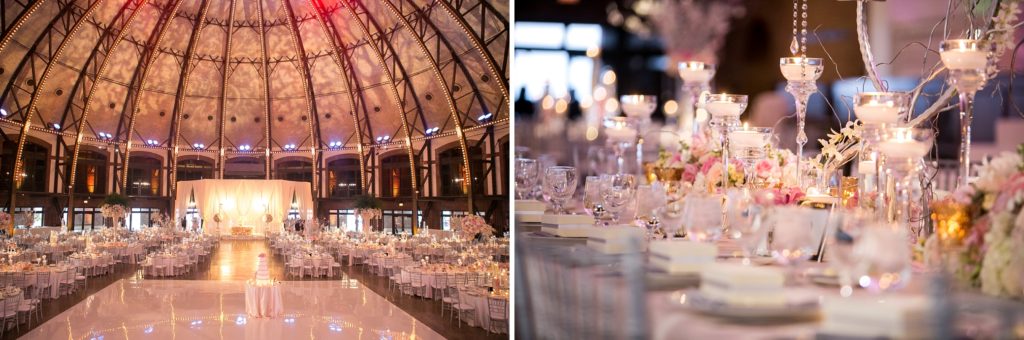
Wedding Palate Inspiration
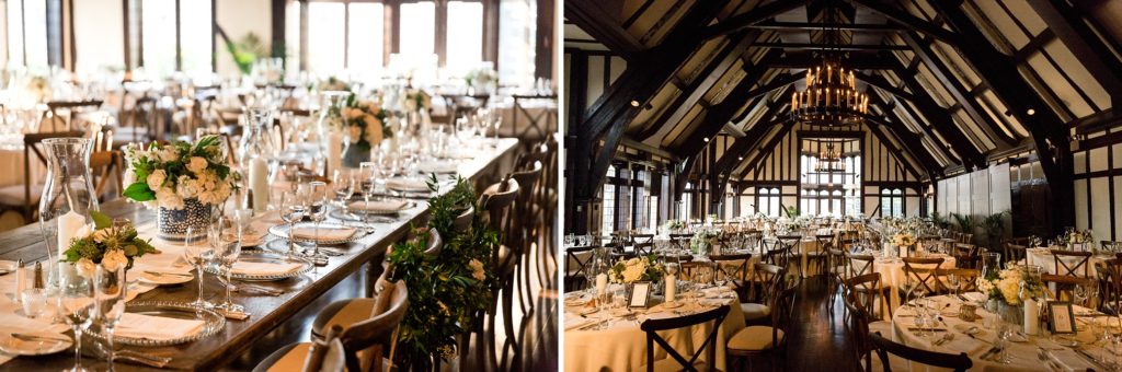
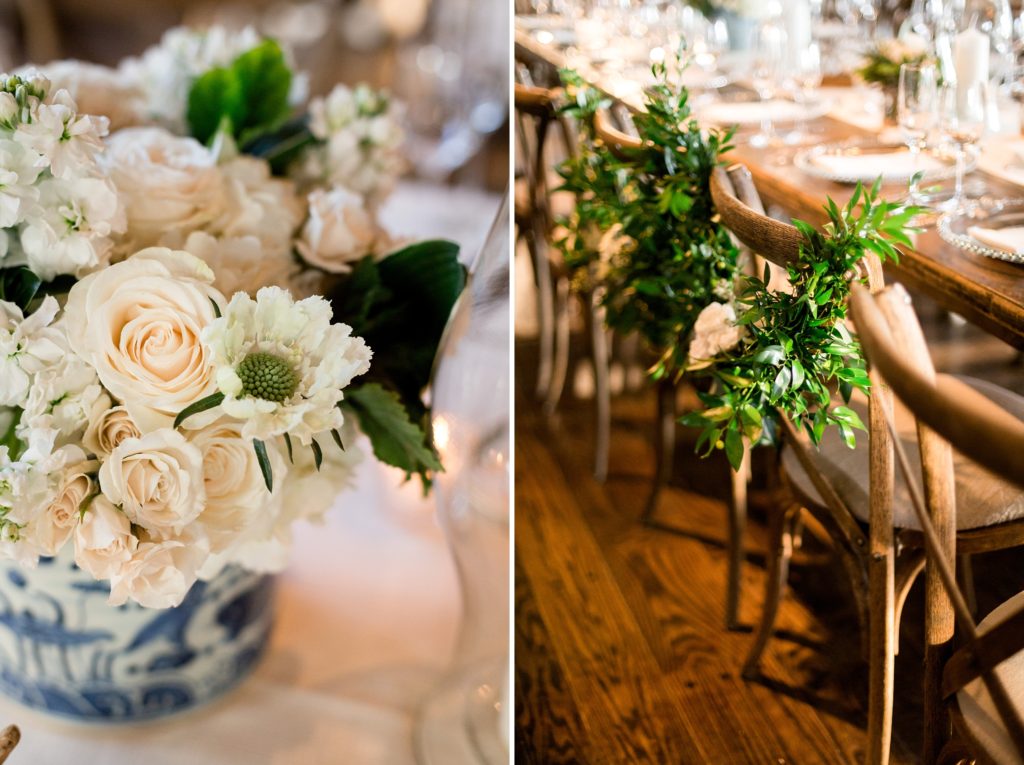
Beautiful Neutrals
I love the way Casey + Thomas accentuated the space by opting for light, neutral colors to offset the rich wood beams in the ceiling. The use of green brought the outside in!
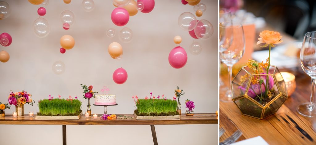
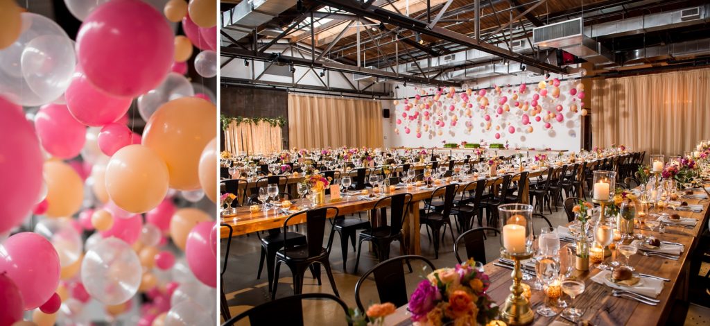
Bright and Fun
Talk about a fun color scheme!! Drawing inspiration from flamingoes, Natalie + Charlie lit up the space with bright pinks, oranges and greens. It’s so summer-y and fun!
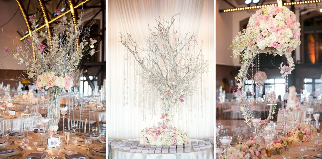
Pink and Elegant


+ COMMENTS
ADD A COMMENT